Using the Corporate Design
Constructing a Grid and Positioning the Logo with Green Elements
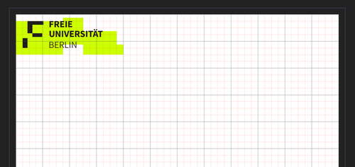
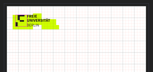
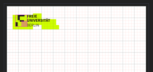
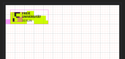
Constructing a grid and positioning the logo with green elements is very simple. A distinction is made between portrait and landscape formats.
For detailed, illustrated instructions, select “Expand all” and follow the steps below.
Portrait format:
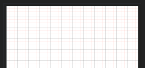
In order to structure the grid more finely and to be able to position the logo with green areas more easily later, it is a good idea to divide each twelfth into 4 smaller sub-units (preferably in different colors, as in the example on the left, so that it remains clear).
Landscape format:
For a landscape format, the grid layout used so far is sufficient (see step 1).
The Colors
Freie Universität Berlin’s primary corporate identity colors are black and green. While green is a key aspect of Freie Universität’s visual identity, it should be used sparingly.
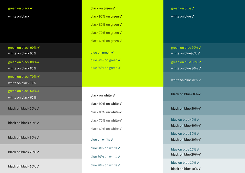
In addition to being a primary color, black and its various shades are used as secondary colors. Additional secondary colors include white and blue. These are used to accentuate the primary colors – in particular green – and create depth. Different shades of blue may also be used.Please make sure that there is sufficient contrast between the foreground and background colors. This will help ensure digital accessibility, another important factor of the new corporate design.
The Colors: Black, Green
| Color | HEX (Web) | RGB (Screen) | CMYK (Print) | Pantone | RAL (Classic) |
| Black | #000000 | 0, 0, 0 | 0, 0, 0, 100 | Black C | 9005 |
| Green | #CCFF00 | 204, 255, 0 | 30, 0, 100, 0 | 382C | 6039 |
Primary Color: Black
| Color | HEX (Web) | RGB (Screen) | CMYK (Print) | Pantone | RAL (Classic) |
| Black | #000000 | 0, 0, 0 | 0, 0, 0, 100 | Black C | 9005 |
| Black 90% | #1A1A1A | 26, 26, 26 | 0, 0, 0, 90 | -- | -- |
| Black 80% | #333333 | 51, 51, 51 | 0, 0, 0, 80 | -- | -- |
| Black 70% | #4D4D4D | 77, 77, 77 | 0, 0, 0, 70 | -- | -- |
| Black 60% | #666666 | 102, 102, 102 | 0, 0, 0, 60 | -- | -- |
| Black 50% | #808080 | 128, 128, 128 | 0, 0, 0, 50 | -- | -- |
| Black 40% | #999999 | 153, 153, 153 | 0, 0, 0, 40 | -- | -- |
| Black 30% | #B3B3B3 | 179, 179, 179 | 0, 0, 0, 30 | -- | -- |
| Black 20% | #CCCCCC | 204, 204, 204 | 0, 0, 0, 20 | -- | -- |
| Black 10% | #E6E6E6 | 230, 230, 230 | 0, 0, 0, 10 | -- | -- |
Secondary Color: White
| Color | HEX (Web) | RGB (Screen) | CMYK (Print) | Pantone |
RAL (Classic) |
| White | #FFFFFF | 255, 255, 255 | CMYK 0, 0, 0, 0 | -- | 9003 |
Secondary Color: Blue
| Color | HEX (Web) | RGB (Screen) | CMYK (Print) | Pantone | RAL (Classic) |
| Blue | #004659 | 0, 70, 89 | 100, 60, 35, 30 | 3035C | 5001 |
| Blue 90% | #195869 | 25, 88, 105 | 90, 55, 30, 25 | -- | -- |
| Blue 80% | #336B7A | 51, 107, 122 | 80, 50, 30, 25 | -- | -- |
| Blue 70% | #4C7D8A | 76, 125, 138 | 70, 40, 25, 20 | -- | -- |
| Blue 60% | #66909B | 102, 144, 155 | 60, 35, 20, 20 | -- | -- |
| Blue 50% | #7FA2AC | 127, 162, 172 | 50, 30, 20, 15 | -- | -- |
| Blue 40% | #99B5BD | 153, 181, 189 | 40, 25, 15, 10 | -- | -- |
| Blue 30% | #B2C7CD | 178, 199, 205 | 30, 20, 10, 10 | -- | -- |
| Blue 20% | #CCDADE | 204, 218, 222 | 20, 10, 10, 5 | -- | -- |
| Blue 10% | #E5ECEE | 229, 236, 238 | 10, 5, 5, 0 | -- | -- |
Additional Colors: Sky Blue, Dusty Sage, Sage, Orange, Burgundy
| Color | HEX (Web) | RGB (Screen) | CMYK (Print) | Pantone | RAL (Classic) |
| Sky Blue | #00A4D1 | 0, 164, 209 | 70, 15, 10, 0 | -- | -- |
| Dusty Sage | #58756A | 88, 117, 106 | 60, 35, 50, 25 | -- | -- |
| Sage | #86B0A0 | 134, 176, 160 | 50, 15, 40, 0 | -- | -- |
| Orange | #E57050 | 229, 112, 80 | 5, 70, 70, 0 | -- | -- |
| Burgundy | #813353 | 129, 51, 83 | 40, 100, 35, 35 | -- | -- |
The Font
The official corporate font is “Source Sans,” but all other sans serif (system) fonts, e.g., “Arial,” can also be used without any problems, whether for writing letters or producing posters, flyers, etc.
Freie Universität Berlin’s official font is “Source Sans” in all its various styles (bold, italics, etc.).
This is an open-source font, meaning that it is exempt from licensing costs and thus free for everyone to use.
If you have a self-administered computer, you can download “Source Sans” from the FUB-IT Portal (formerly ZEDAT Portal): https://portal.zedat.fu-berlin.de/ or directly from Google https://fonts.google.com/specimen/Source+Sans+3
The members of Freie Universität using computers provided by FUB-IT have access to this font on their computers.
Interested users can follow the further development of the font on GitHub: https://github.com/adobe-fonts/source-sans
Designing Posters
Below are various templates for you to use when designing posters according to the corporate design guidelines.
“Standard posters” are the poster sizes DIN A1 and DIN A2. They are usually printed by commercial print shops in CMYK (Euroscale). The font “Source Sans,” the official Freie Universität colors, and logo variants are preset in the Affinity templates provided. There are also sample layouts that you can use as the starting point for your own products.
You may also send us your posters and/or feedback about the templates.
To use the Affinity templates, you should be familiar with the program. Affinity training is offered (in German) by Freie Universität Berlin’s Center for Continuing Education.
See also the section in our FAQs about using Affinity.
“Notices” refer to poster sizes DIN A3 and A4 that can usually be printed quickly and easily on an office printer. Templates for these are available in both PowerPoint and Affinity formats.
The font “Source Sans,” the official Freie Universität colors, and logo variants are preset in the Affinity templates provided. There are also sample layouts that you can use as the starting point for your own products.
If you plan to make the notices available online, please remember to design your PDF files to be as digitally accessible as possible.
You may also send us your notices and/or feedback about the templates so that we may improve them further.
To use the Affinity templates, you should be familiar with the program. Affinity training is offered (in German) by Freie Universität Berlin’s Center for Continuing Education.
See also the section in our FAQs about using Affinity.
The poster size A0 is the poster size typically used in universities for scientific/academic posters. Templates for them are available in both PowerPoint and Affinity formats.
The font “Source Sans,” the official Freie Universität colors, and logo variants are preset in the Affinity templates provided. There are also sample layouts that you can use as the starting point for your own products.
You may also send us your posters and/or feedback about the templates so that we may improve them further.
Please note that students and doctoral researchers must receive permission from their instructor/advisor to use the templates, in accordance with the Rules for Using the Logo.
To use the Affinity templates, you should be familiar with the program. Affinity training is offered (in German) by Freie Universität Berlin’s Center for Continuing Education.
See also our FAQs about using Affinity.
Designing Flyers
There are various templates available which you may use when designing flyers.
The term “letter-fold” usually means a six-page flyer that is size DIN A4 when unfolded. They are usually printed by commercial print shops in CMYK (Euroscale). The font “Source Sans,” the official Freie Universität colors, and logo variants are preset in the Affinity templates provided. There are also sample layouts that you can use as the starting point for your own products.
You may also send us your flyers and/or feedback about the templates.
To use the Affinity templates, you should be familiar with the program. Affinity training is offered (in German) by Freie Universität Berlin’s Center for Continuing Education.
See also our FAQs about using Affinity.
The term “zigzag-fold” usually means a six-page flyer that is size DIN A4 when unfolded, where all six pages have the same width. They are usually printed by commercial print shops in CMYK (Euroscale). The font “Source Sans,” the official Freie Universität colors, and logo variants are preset in the Affinity templates provided. There are also sample layouts that you can use as the starting point for your own products.
You may also send us your flyers and/or feedback about the templates.
To use the Affinity templates, you should be familiar with the program. Affinity training is offered (in German) by Freie Universität Berlin’s Center for Continuing Education.
See also our FAQs about using Affinity.
Designing Postcards
There are various templates available which you may use when designing postcards.
Postcards in A6 format are the classic “picture postcards” which can also be used as a convenient flyer. They are usually printed by commercial print shops CMYK (Euroscale). The font “Source Sans,” the official Freie Universität colors, and logo variants are preset in the Affinity templates provided. There are also sample layouts that you can use as the starting point for your own products.
You may also send us your postcards and/or feedback about the templates.
To use the Affinity templates, you should be familiar with the program. Affinity training is offered (in German) by Freie Universität Berlin’s Center for Continuing Education.
See also our FAQs about using Affinity.
Producing a Video with Freie Universität’s Corporate Design
Below are some tips for using Freie Universität Berlin’s corporate design in your video.
Freie Universität’s official font is “Source Sans.” Freie Universität Berlin’s corporate design does however permit the use of other non-serif (system) fonts such as Arial in your videos.
The color of the text in text overlays or intertitles may be white or black. Make sure that there is always sufficient contrast when using text in your videos.
Use the PowerPoint template on the downloads page where the settings are already preset.
Do not use drop shadows or outlines to design your text.
Logo
The Freie Universität Berlin logo appears only in the closing credits of a video on a white background. Other institutions are only named with text (for official cooperation projects, an additional picture panel with the logos of the partners may be inserted before the closing credits.
The logo does not appear in either text overlays or the title credits of a video.
Icon
The Freie Universität icon is shown for the entire duration of the video in the form of a watermark in a fixed position at the top left corner (within the safe area).
For optional positioning, see the PowerPoint template on the downloads page.
The Freie Universität icon may not be used in other cases.

